Microsoft is introducing a new taskbar on Windows 11, and here's everything you need to know.
Alongside a brand-new Start menu, Windows 11 is also introducing a new version of the Taskbar, which might look similar to the one we know on Windows 10, but the new experience is getting a lot of improvements.
For example, the new Taskbar has a center alignment, redesigned Start button, and new buttons for Search, Task View, Widgets, and Chat. Also, there are new animations for launching, minimizing, maximizing, and installing applications, and Microsoft is improving many aspects of the system tray.
However, it's not all good news since the new Taskbar for Windows 11 lacks many customizations available in previous versions.
In this Windows 11 guide, we dive deep into the improvements and design changes with the new Taskbar.
The redesigned Taskbar
Although the Windows 11 taskbar may look similar to the previous version, it's not. Similar to the Start menu, Microsoft has made a lot of good (and bad) changes to the experience.
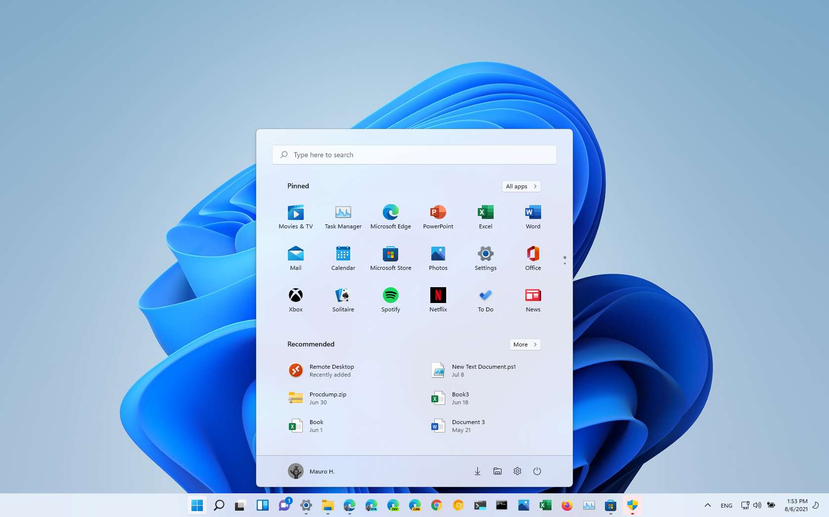
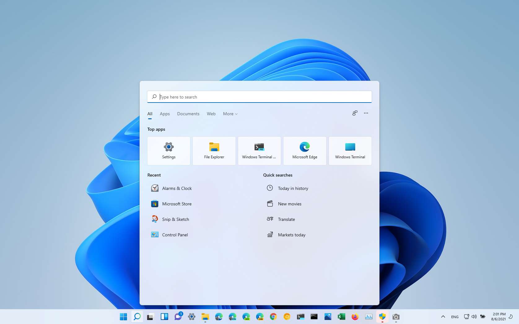
The new Taskbar has a centered alignment, but you can always change the behavior to the left like in previous versions. The interface is also six pixels taller than the one available on Windows 10. In addition to the buttons aligned in the middle of the screen, you will notice that there's a new Start logo button, as well as new buttons for Search, Task View, Widgets, and Chat. Cortana and My People are no longer part of the experience.
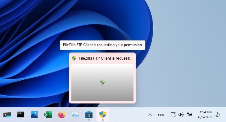
Also, elements like tooltips, overflow menu, previews, and highlighting buttons in the Taskbar now follow the new design style with a rounded corner. When an app requires your attention, the flashing will now be more subtle, it'll eventually stop, and you will see a new backplate with a light red color and red pill icon letting you know the app requires your attention.
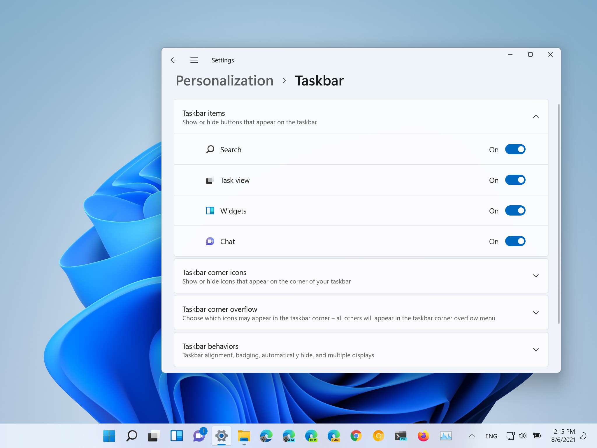
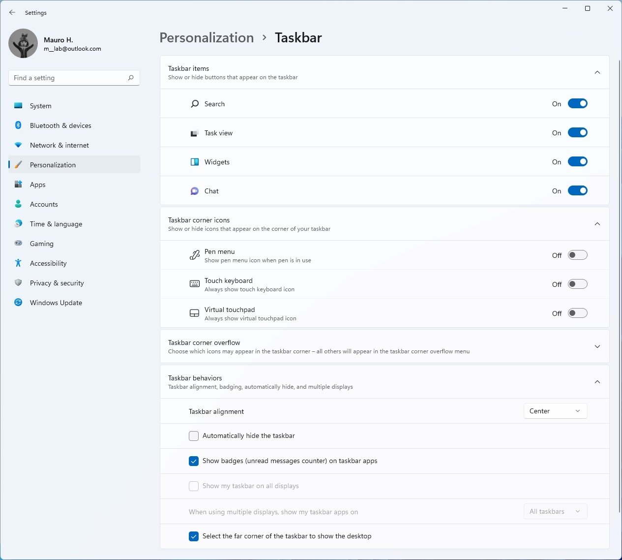
If you don't like one of the feature icons, you can remove them from Settings > Personalization > Taskbar.
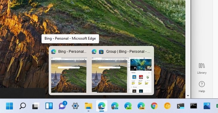
When you hover over the feature button, a new preview will appear with some recent items or a quick view of the feature. If you hover an open app, the thumbnails preview will show like in previous versions.
As part of the multitasking experience, when using "Snap groups," you can now hover an app in the Taskbar, and if it's part of snapped gourd, the experience will let you switch back to the snapped windows after switching to another app, so you do not have to re-snap them again. (Although this feature appears in the Taskbar, this behavior's setting control is located on the Multitasking settings page.)
On Windows 11, the search box has been replaced with the Search button that opens Windows Search. The experience remains virtually the same as the one on Windows 10, with the difference that you will now find a search box at the top.
The new Taskbar also features new animations. For example, you will notice a new bouncing animation as the Taskbar loads on the desktop when the device starts. Also, there's a new small pill-shaped indicator that changes size for running applications to distinguish whether they are minimized or maximized. You will also see a new animation when clicking an app to open, minimize, and maximize. And there is a new progress indicator for installing applications.
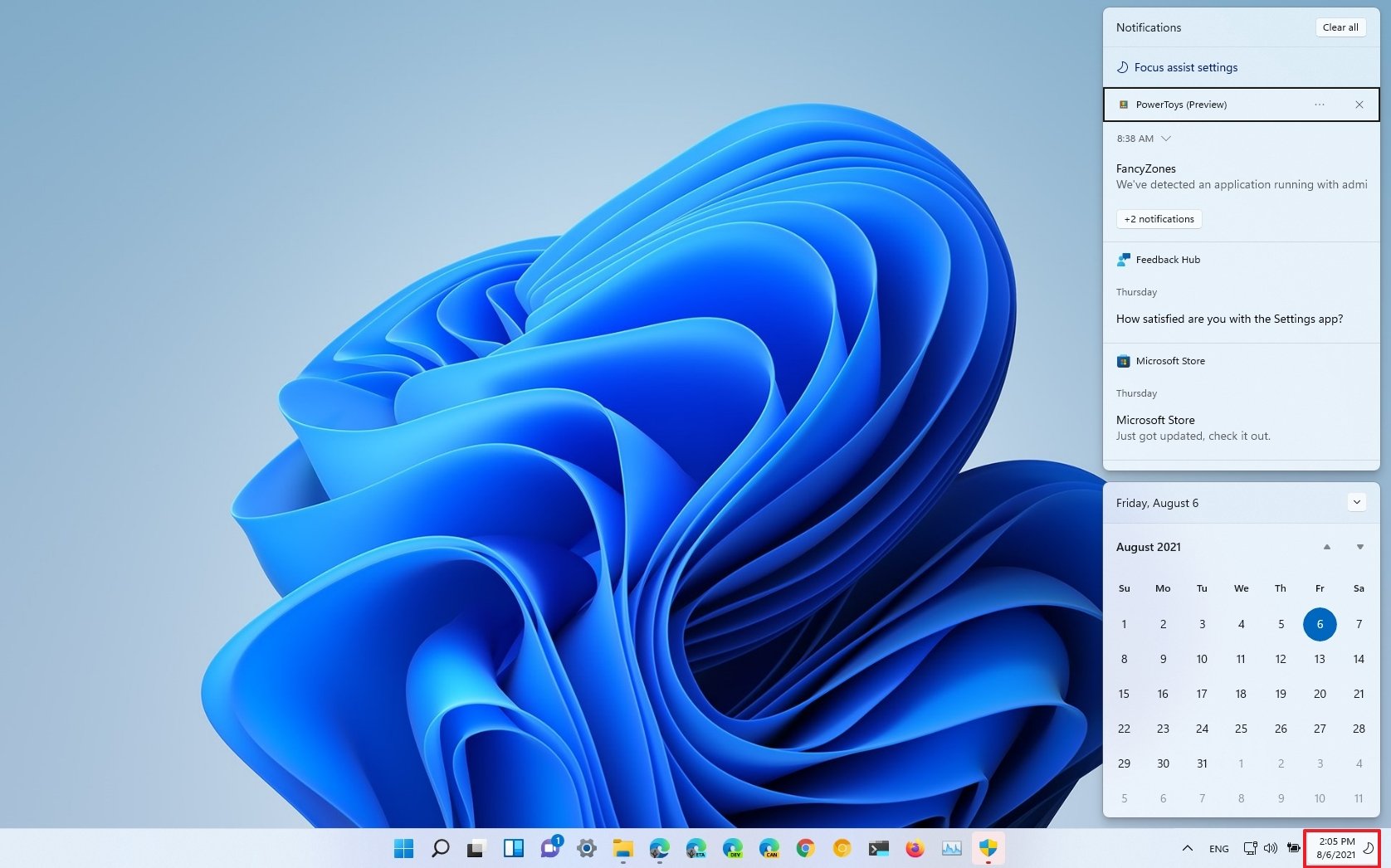
The system tray (bottom-right corner) is also improving. In this new version, Windows is grouping the icons logically. For example, the time and date and the Focus assist icon are a group. When you click it, it opens the new "Notification Center" that includes a full-month calendar and all your notifications.
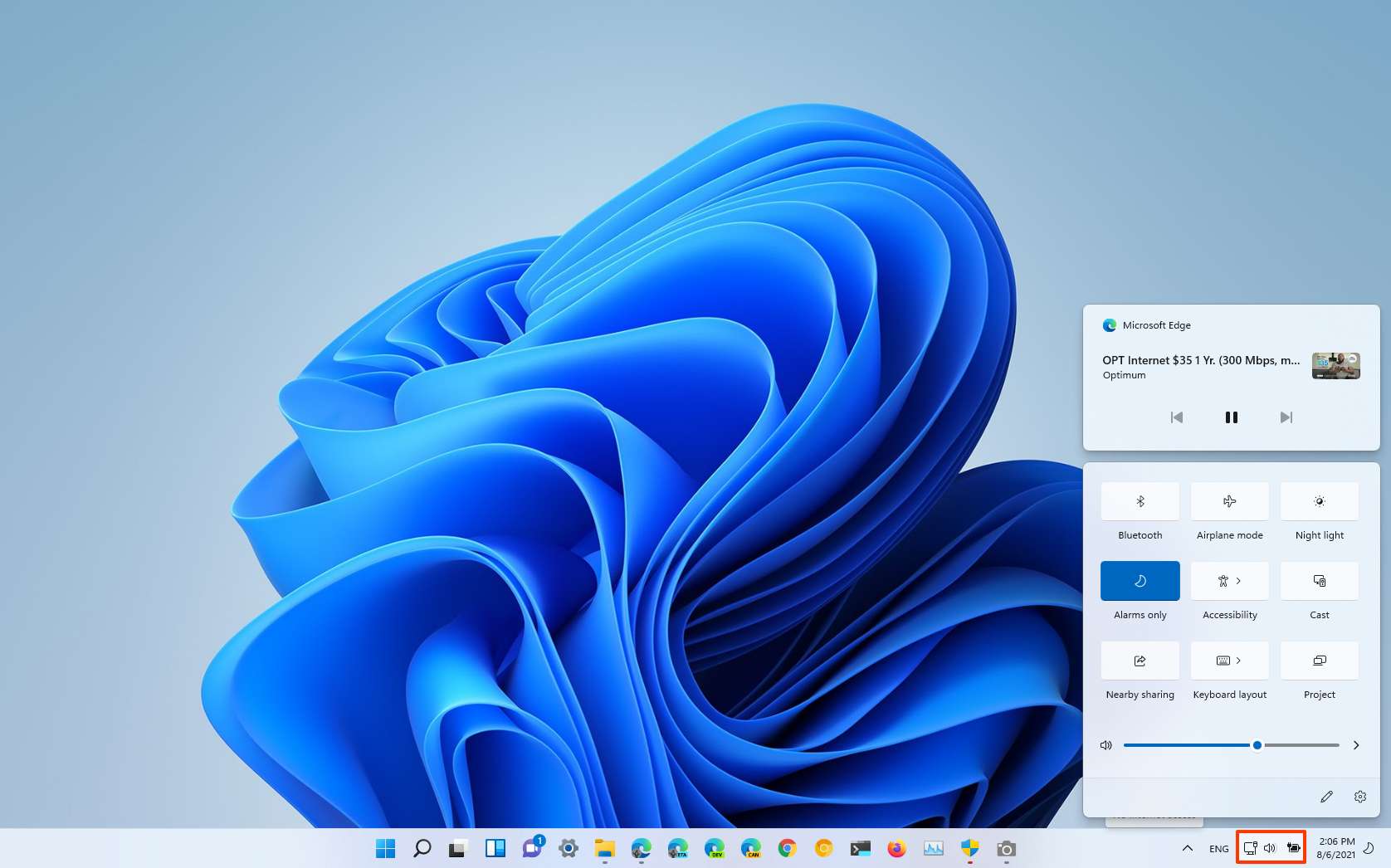
Then there's the group that includes network, volume, and power icons. When you click it, it opens the new Quick Settings experience that houses common settings for volume, brightness, Wi-Fi, Bluetooth, Airplane mode, Night light Accessibility, Cast, and more.
If you are playing a video or music on Microsoft Edge, the Quick settings will also display the media playback controls to control the stream.
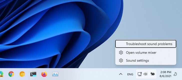
Of course, you can always right-click any icon to access its settings or select one of the available options.
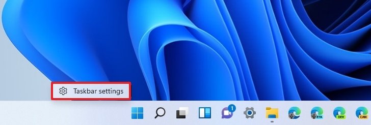
The context menu for the Taskbar has also been reworked, and it now only includes an option to open the "Taskbar" settings page. On the settings page, you can add or remove items, control the icons that appear in the corner and the apps that appear in the overflow menu.
Also, in the Taskbar behaviors section, you can control the alignment of the Taskbar, enable or disable badging for apps, auto-hide, control multiple displays options, and even disable the show desktop button.
The problems with the new Taskbar
Alongside the welcome improvements, Microsoft is making many changes that many may feel as if the Taskbar is going backward instead of forward this time around.
One of the oddest changes is that the Taskbar is now locked at the bottom of the screen, and you can no longer place it at the top or either side of the screen.
You can only show icons in the Taskbar. If you were among those who like to show labels and never combine apps, this is no longer an option either.
Microsoft has also confirmed that users won't be able to drag and drop files or apps to pin them to the Taskbar.
On Windows 10 and previous versions, you also had the option to make the icons larger or smaller. There is only one size of icons in this new version, and the option to customize this behavior is gone. Furthermore, you can no longer adjust the height of the Taskbar.
Although the system tray includes several tweaks, it may now be even harder to use since the icons are divided into groups, and you can't hide the clock or any of the other system icons, including volume, network, microphone, etc. If you want to see the clock, it gets worse because it won't show on secondary displays.
More Windows resources
For more helpful articles, coverage, and answers to common questions about Windows 10 and Windows 11, visit the following resources:


0 Commentaires