Windows 11 comes with a new Start menu, and here's all you need to know about the experience.
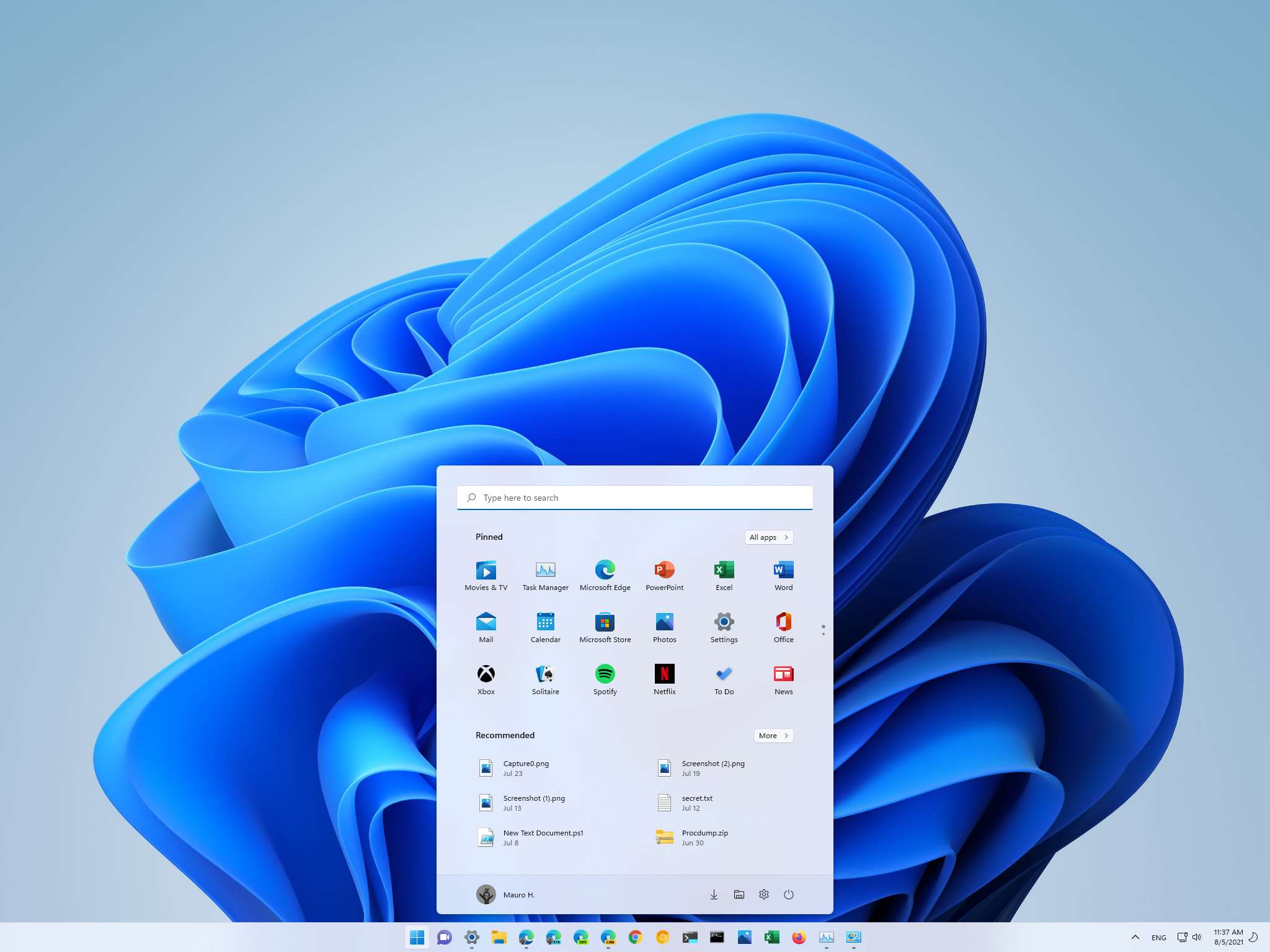
On Windows 11, one of the most significant visual changes is the redesigned Start menu. The new menu is similar to the design previously available on Windows 10X, which drops the Live Tiles and embraces a more traditional app launcher approach with classic icons and minimal design with rounded corners for a more consistent, simple, and useful experience.
The menu includes pinned apps, recent files and apps recommendations, a handy search box at the top to look for anything, and the ability to shut down or restart the device quickly. It is a more simplified experience than what we have seen in previous versions.
Alongside the new layout, perhaps the most noticeable change is that the Start menu now aligns to the center of the screen. However, those who still prefer having the menu aligned to the left can change this behavior in the "Taskbar" settings page.
In this Windows 11 guide, we dive deep into the improvements and design changes with the new Start menu.
The redesigned Start menu
The new Start menu has four main sections. At the very top, that's where you will find the search box, which acts as a link to bring up the Windows Search interface that allows you to search for apps, settings, files, and the web. Although the interface has been tweaked, it remains the same as the search experience on Windows 10.
Then there is the "Pinned" section where you pin your favorite and more frequently used applications. The main page can only show up to 18 icons, but you can always pin more icons. You will only need to scroll down the page or use the navigation controls on the right side to find the apps.
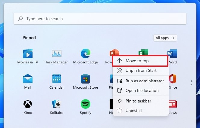
The section also supports drag-and-drop, which means that you can place the icons in any position you want. Furthermore, you can right-click an app and select the "Move to top" option to move the icon to the top of the list. Using the app context menu, you will also find more options to pin the app to the Taskbar, access its settings, and uninstall the app.
If you are trying to remove a Universal Windows Platform app, the app will be deleted without extra steps. However, when getting rid of traditional desktop programs, the "Programs and Features" page from Control Panel will open instead to continue uninstalling the application.
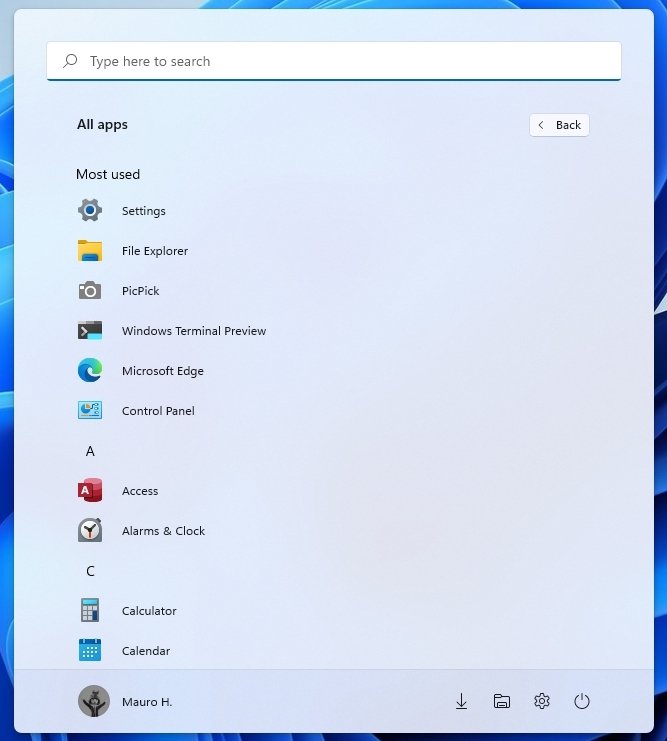
For any app not available on the main page, you can click the "All apps" button to find it. If you have a long list of apps, you can always click the letter to access the dial and quickly skip to the position where the app is listed.
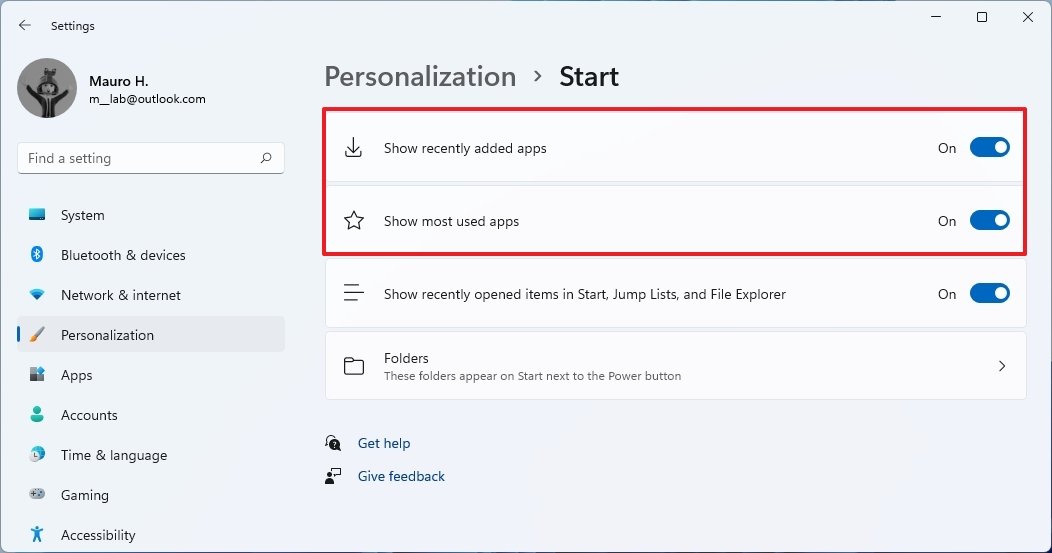
The Start settings page located in Settings > Personalization also includes a couple of options to show recently added or most used apps in the main list of apps.
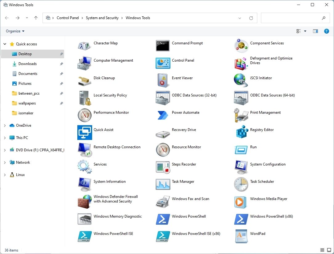
In addition, Microsoft also made some changes to the "All apps" list. For example, the "Windows Administrative Tools" folder has been renamed to "Windows Tools." Also, the item is no longer a folder either. Instead, it is an option with a new icon that opens the Windows Tools page in Control Panel, which combines all the options previously available in the Windows Accessories, Windows Administrative Tools, Windows PowerShell, and the Windows System folders.
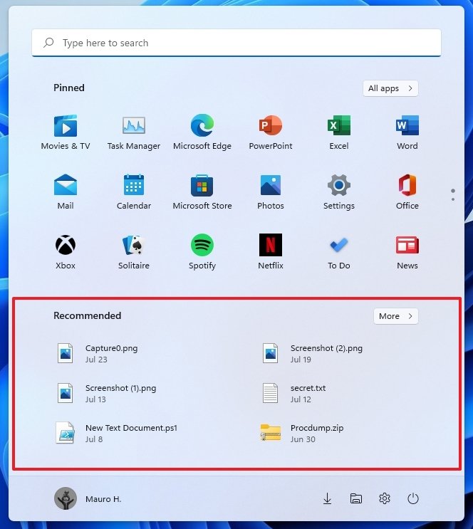
The Recommended section comes after the list of pins, and here is where you will find suggestions to pick up recently open files and installed applications. This page can only hold up to six items, but you can click the More button to access more content.
You can also right-click an item to access the context menu to open the file location or remove the item from the list. If it's an app, you will find options to pin it to Start or Taskbar, Run as administrator, access its settings, or remove it from the list.
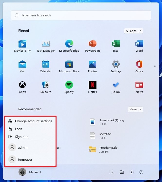
Finally, at the bottom, you will find the profile and power menus. Like in previous versions, the profile menu includes the options to access your account settings, lock the device, sign out, or switch user accounts.
The Power menu, by default, includes the options to shut down and restart the device. However, depending on the hardware capabilities, you will find the entries to hibernate and sleep the computer. Furthermore, if an update is pending, the menu will also show the estimated time to complete the installation.
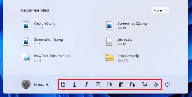
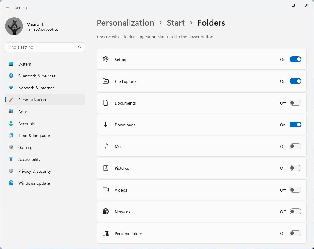
In this section, you can also show access to the different system folders. For example, you can show access to the Settings app, File Explorer, Documents, Downloads, Music, Pictures, Videos, Network, and Personal folder.
The ability to choose which folders appear on Start next to the Power button isn't new. This was the part of the left navigation pane on Windows 10.
Start menu missing features
While many aspects of the new Start menu are different and useful, this time around the company has opted for a more straightforward experience that may seem like a step backward for many users since it's not as customizable as the legacy menu.
For instance, in addition to ditching the Live Tiles, you can no longer create groups of apps or organize apps into folders. The ability to resize the menu is gone, and the full-screen mode is not an option anymore.
Also, if you didn't like the app recommendations in the Start menu on Windows 10, you won't like the new approach either. In new installations, by default, the "Pinned" section will come with several promotional apps that are not installed. However, they are difficult to distinguish from your other apps, meaning that you could quickly end up installing extra apps you don't need.
However, everything considered, the new Start menu is a more simplified version of the legacy menu that offers all the necessary elements to "start" using the system.
More Windows resources
For more helpful articles, coverage, and answers to common questions about Windows 10 and Windows 11, visit the following resources:



0 Commentaires