Brave Browser for Android was updated to version 1.36.112 recently. The latest build of the app has removed the Tab Stack view, and instead forces the Grid layout as the only way to switch between tabs.

The above screenshot shows stacked tabs (cascade view) in Brave Browser in an older version of the app.
And this is what the new Grid layout looks like in the browser's current version.

Firefox users may remember that the grid view was added to the mobile version of the browser in version 84, that was released in December 2020. As a Firefox user, I never really liked the grid layout or the idle tabs for that matter. It's an awful way to browse and manage tabs, which is why I use the List view. Though it does not look as good as stacked tabs, but it's better than the grid view.
Why do browser developers keep pushing Grid view as if it is the best option for tabs? Mobile devices have small screens, and hence can only display a limited number of cards at a time, which means the user has to scroll through a longer list of tabs than in stacked view.
This problem began about a year ago, when Google Chrome v88 introduced Grid View for tabs. Users had the option to disable it by changing a preference, that didn't last long, as Google removed the option to disable tab groups when Chrome 91 was rolled out.
Brave browser on the other hand, used to support it until the latest update. If you are still on an older version of the app, head to brave://flags and search for Tab Grid Layout, and Tab Groups. Tap on the drop-down menu and change the values for each flag from default to disabled. This used to turn off the grid view, and bring back the good old tab stack mode. But not anymore, even though the flags exist, modifying them does nothing.
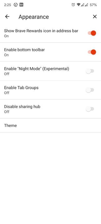
The Chromium open source project is the reason for this change. I'm not defending Brave, I'm just pointing out where the change began. Since Brave Browser relies on the same source code, it too removed said feature from the latest version. The app's appearance page no longer has the option to disable Tab Groups either, which probably explains why editing the flag doesn't work, the old view mode doesn't exist.
Brave users are furious about the change, and have raised their pitchforks over at the app's GitHub repository, the official community forums, and also voiced their concerns about the Grid Layout on reddit.
In a way, I'm glad Firefox offers List View as a choice for the user. Vivaldi users can opt to use a tab bar, but it is not exactly as easy to use as a tab stack, and the app's tab switcher uses the same grid view as Chromium-based browsers.
If you really want to disable Tab Groups in Brave browser, there is a workaround. I don't really recommend it since it involves downgrading the browser to a previous version, as it could put your data at risk due to security issues that were patched in later builds. If you don't care about that, download a beta build APK of Brave Browser from a few weeks ago. e.g. Beta 1.36.104.

Install the app, open the app's settings page, and navigate to the Appearance section. Toggle the option labeled "Tab Groups", to disable it. You will need to restart the app to get the tab stacking feature back.
Do you like tab stacks or grid view in mobile browsers?
Thank you for being a Ghacks reader. The post Brave Browser for Android removes support Tab Stack view, forcing users to use the Grid layout appeared first on gHacks Technology News.

0 Commentaires