Microsoft reduced the functionality of several core operating system areas when it launched the Windows 11 operating system. One of these was the redesigned Start Menu, which I called barely usable in 2021.
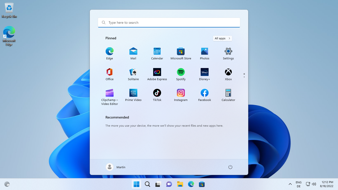
Microsoft removed quite a bit of functionality from the Windows 11 Start Menu. Folders, groups, the ability to display all apps and pinned items at the same time, live tiles, and options to resize the Start Menu were all removed in Windows 11.
The Windows 11 start menu separated pinned programs and recommended; Windows 11 users who preferred to disable the recommended items were left with a blank area that was of no use whatsoever. Room for pinned locations was limited, which made the removal of folder and grouping options precarious, as these could have improved the lack of room somewhat.
In a hurry? Here are the main changes:
- Folders return. Drag and drop a pinned item on another to create a folder. An animation provides hints in this regard.
- You may rename folders, rearrange apps inside folders and remove pinned apps from folders.
- Start Menu layouts are available. More Pins expands the Pinned section, while More Recommendations expands the recommendation section of the Start Menu.
The Start Menu in Windows 11 version 22H2
One of the goals of Windows 11 version 22H2 seems to be redemption, or at least, to bring back some of the features that were dropped in the initial release of Windows 11. Whether Microsoft had the intention to bring back these features all along, or decided to restore them based on user feedback is unknown.
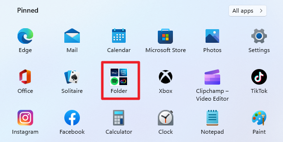
Windows 11 users who open the Start Menu of Windows 11 version 22H2 for the first time won't notice many differences right away. It looks and feels like the original Windows 11 Start Menu on first glance.
Some may even miss the functionality that Microsoft restored, unless Microsoft plans to provide guidance on those.
One of the main points of criticism leveled at the original Windows 11 Start Menu was that Microsoft removed the ability to group pinned items.
The improved Start Menu supports the creation of folders. All it takes is to drag one pinned item over another to create a new folder or to add it to an existing folder. Dropping pinned items on a folder may be difficult at first, as Windows may mistake the attempt for one that moves a pinned items to a new position in the Start Menu.
A click or tap on a folder opens all included items in an overlay on the screen. From there, it takes another click or tap to execute one of the included programs. A click or tap outside the overlay area hides it again so that the full Start Menu becomes visible again.
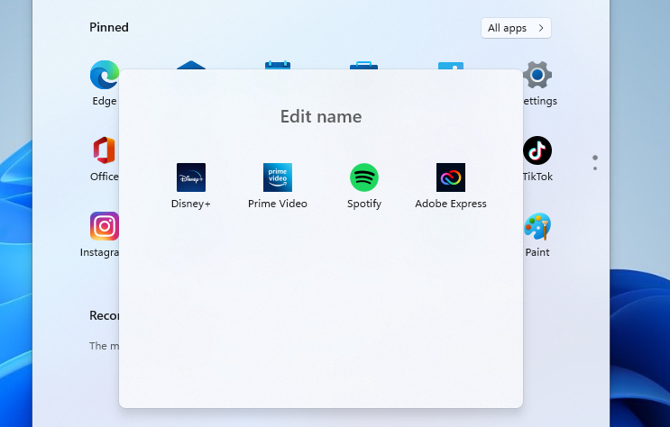
The default name of a newly created folder is always folder, even when users create multiple folders. The name of a folder can be changed with a click on the "edit name" field when it is expanded.
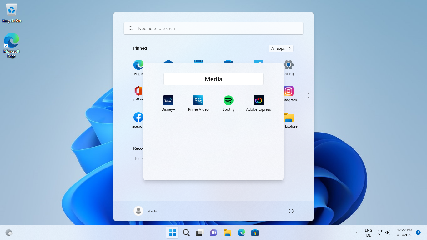
Once done, the new name is displayed in the the Windows 11 Start Menu.
Folders have a few limitations. You can't drop a folder onto another to create subfolders or merge the two. There is also a limit of four pinned icons that each folder displays in the Start Menu, even if more pinned icons are stored inside. The icons of the first four pinned items are displayed as the folder icon in the Start Menu. You may reorder them to display different icons.
Another limitation is the inability to delete folders right away. You need to move each pinned item out of the folder first; the folder itself disappears into thin air once the last pinned item is removed from it.
Start Menu Layouts
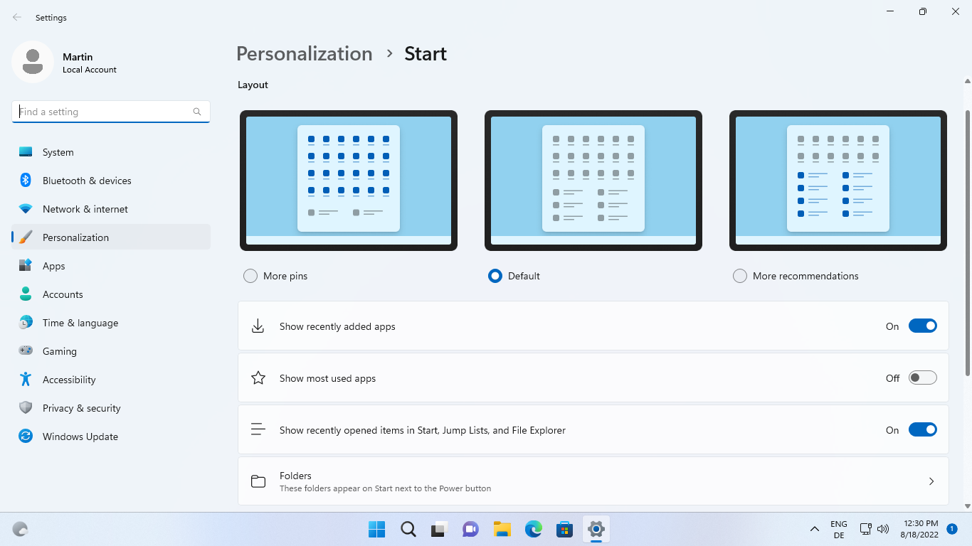
Another criticism leveled at Microsoft was that the Windows 11 Start Menu had a fixed layout that could not be changed. Users who disabled the recommended section could not use the lower half of the Start Menu because of that.
Microsoft introduces Start Menu layouts in version 22H2. Three different layouts are supported: one of them is the default half-and-half layout, the other two give pinned items or recommendations more room in the Start Menu.
The "more pins" layout gives pinned items most of the available room. Recommended is reduced to a small section at the bottom.
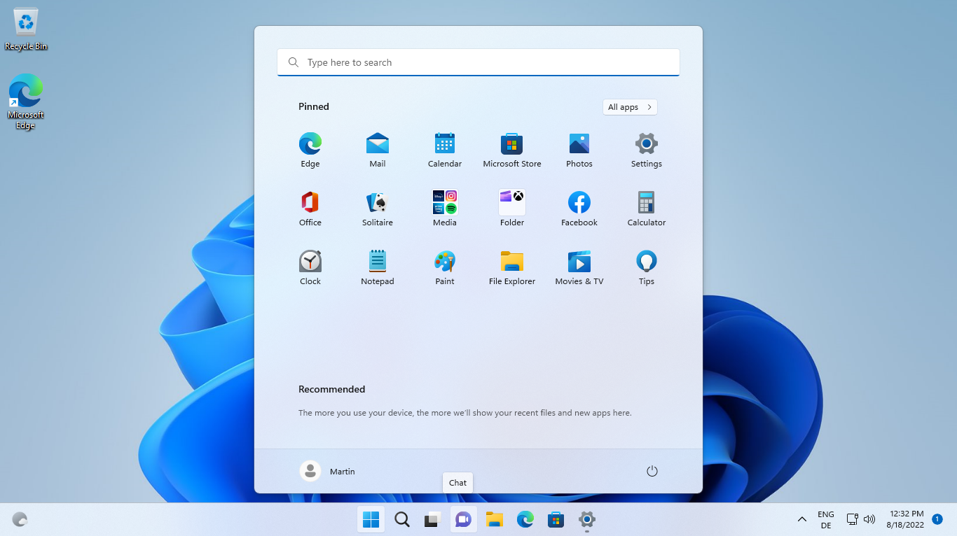
Users who would have preferred an option to remove the recommended section entirely will be disappointed, as no such option exists in Windows 11 version 22H2.
Still, the new "more pins" layout unlocks more room for pinned items on the Start Menu, which means less scrolling for some users.
The "more recommendations" layout prioritizes recommendations over pinned items. It expands the recommended section of the Start Menu and limits the pinned section to two rows.
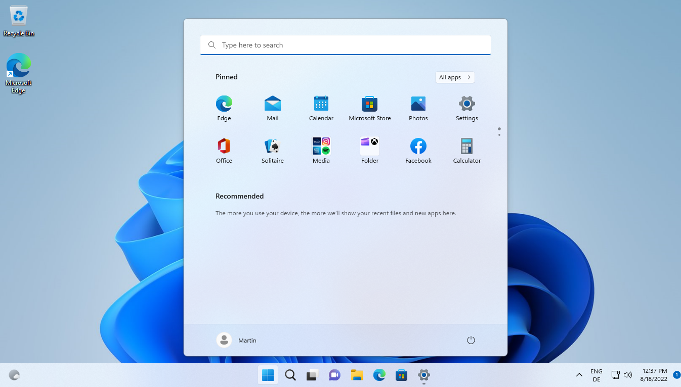
Options to show recently used apps and opened items need to be enabled in the Windows 11 preferences. It may take some time before recommendations are displayed in the Start Menu.
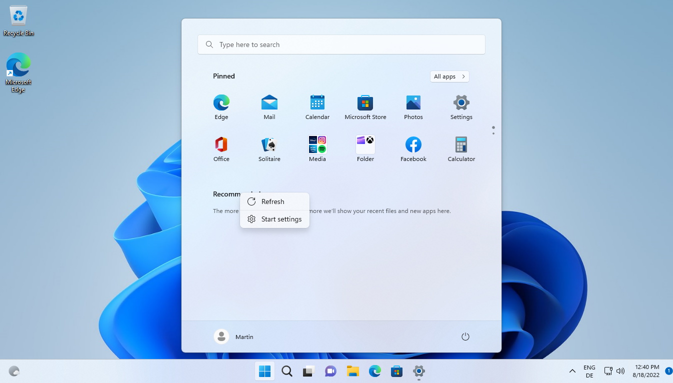
The pinned and recommended group titles in the Start Menu have a context menu now. Right-click on pinned to get a direct link to the Start Menu settings in the preferences app. A right-click on recommended displays the same link and an option to refresh the listing manually. Windows 11 refreshes recommended content automatically in intervals.
Closing Words
Microsoft restores some functionality to the Start Menu in Windows 11 version 22H2, which it removed in the original Windows 11 release. Folders give users more options when it comes to arranging and managing pinned items.
The Start Menu layouts address another point of criticism, but some users, especially those who disable recommendations, may argue that the changes do not go far enough. Microsoft could have added a switch to remove Recommendations entirely from the Start Menu to expand the pinned section even further.
Other missing features, including the ability to resize the Windows 11 Start Menu or create groups won't make a return in Windows 11 version 22H2. While there is still a chance that Microsoft may introduce them again in a future update, it is certain that Live Tiles won't make a comeback in Windows 11.
Now You: what is your take on these changes?
Thank you for being a Ghacks reader. The post Windows 11 version 22H2: Start Menu changes appeared first on gHacks Technology News.


0 Commentaires