Third-party developer Stardock aims to fix Windows 11.
Microsoft's Windows 11 is a breath of fresh air for long time Windows users, with a new design and enhanced productivity features that make using great for work and play. However, it's not all sunshine and rainbows, as Windows 11 also attempts to simplify long time features and functions to the point of them no longer being configurable in the ways many users might expect them to be.
This isn't more apparant than with the new Start menu and Taskbar, which look pretty on the surface, with fresh animations and a simplified UX, but at the cost of functionality such as being able to move around and change components in the Start menu or right-click the Taskbar to access additional options. For most people, losing that functionality won't be a problem, but for some, it's a big deal.
Luckily, Stardock has an app called Start11 that brings back the ability to customize the Start menu and Taskbar in ways similar to that of previous versions of Windows, plus even more customizable options that Windows has never had out of the box. Start11 just launched for $5.99, and we wanted to highlight some of the features it includes in case you're interested in getting it to improve your Windows 11 experience.
Configurable Starts
Start11
Bringing configurability back to Windows 11
Are you unhappy with the new Taskbar and Start menu's limited customization features? Start11 is a third-party app that aims to fix that by bringing back and adding new configurable options for the Start and Taskbar experiences.
New Starts
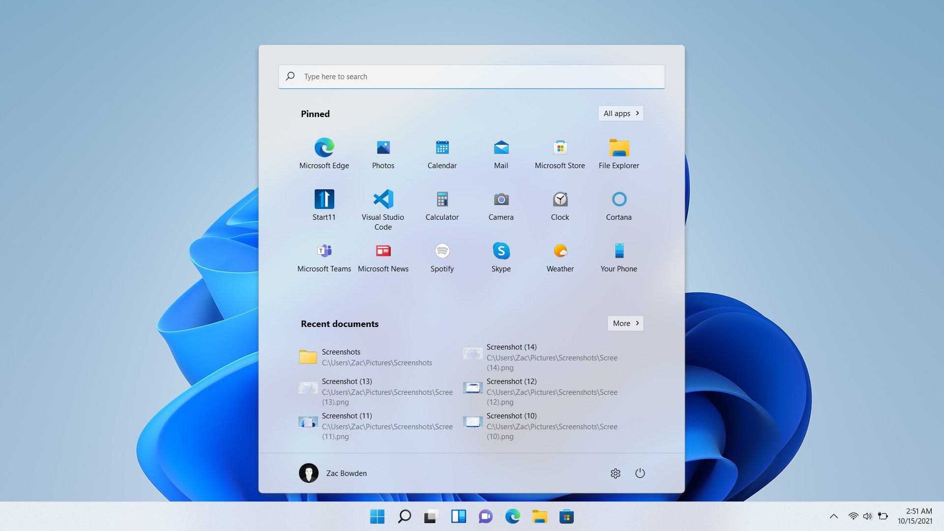
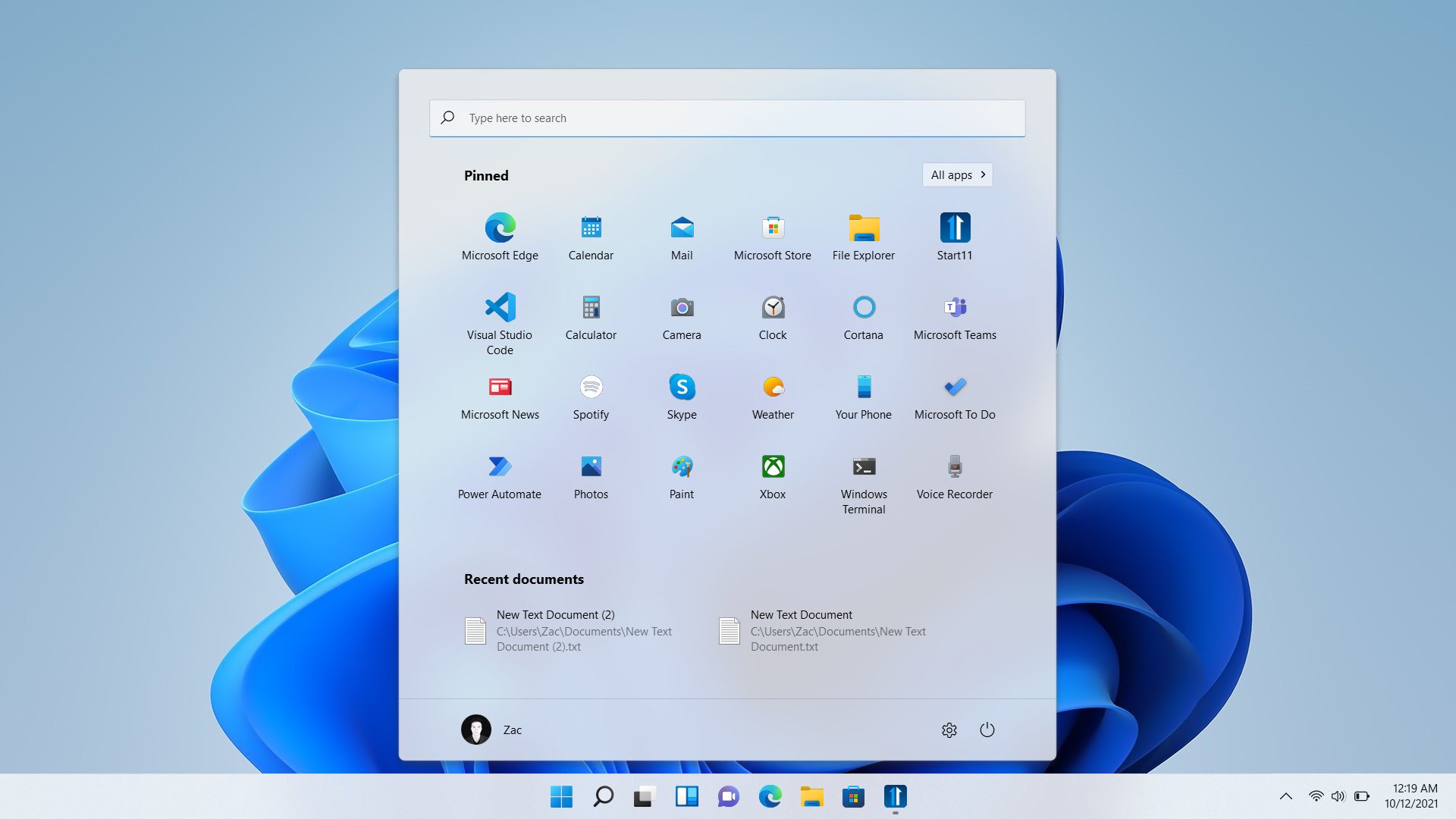
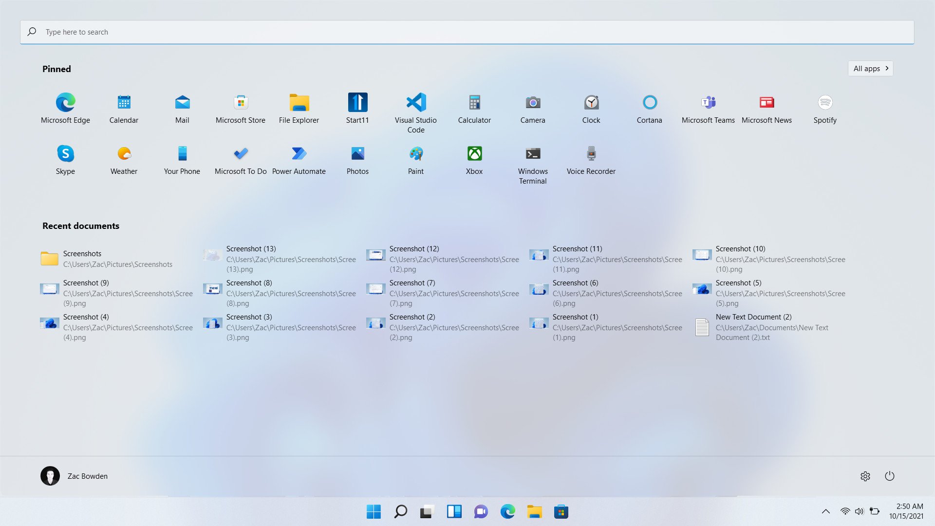
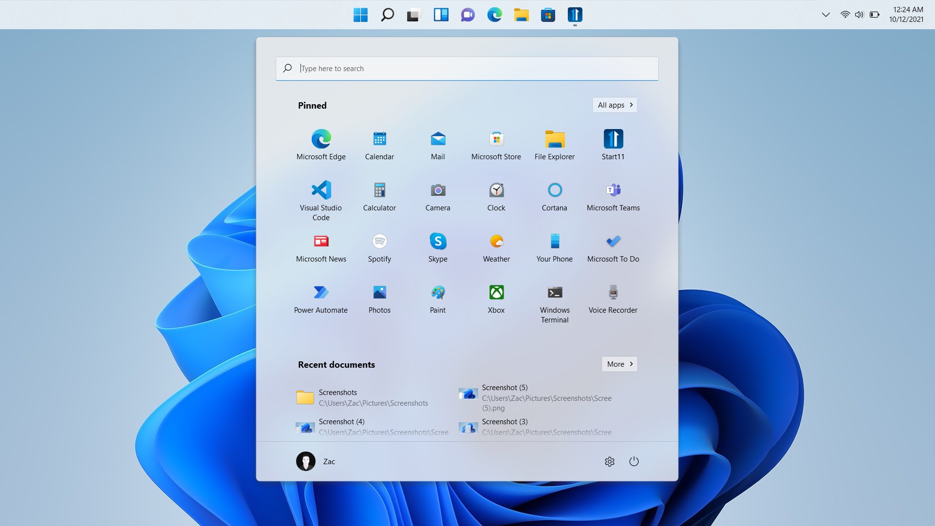
The big selling point of Start11 is that it introduces a more customizable and feature-complete version of the new Windows 11 Start menu. With a similar UI, you can now arrange apps anywhere in the grid, which is no longer limited to just three rows of six icons. You can have as many rows as required, and you can even resize the menu to make room for more.
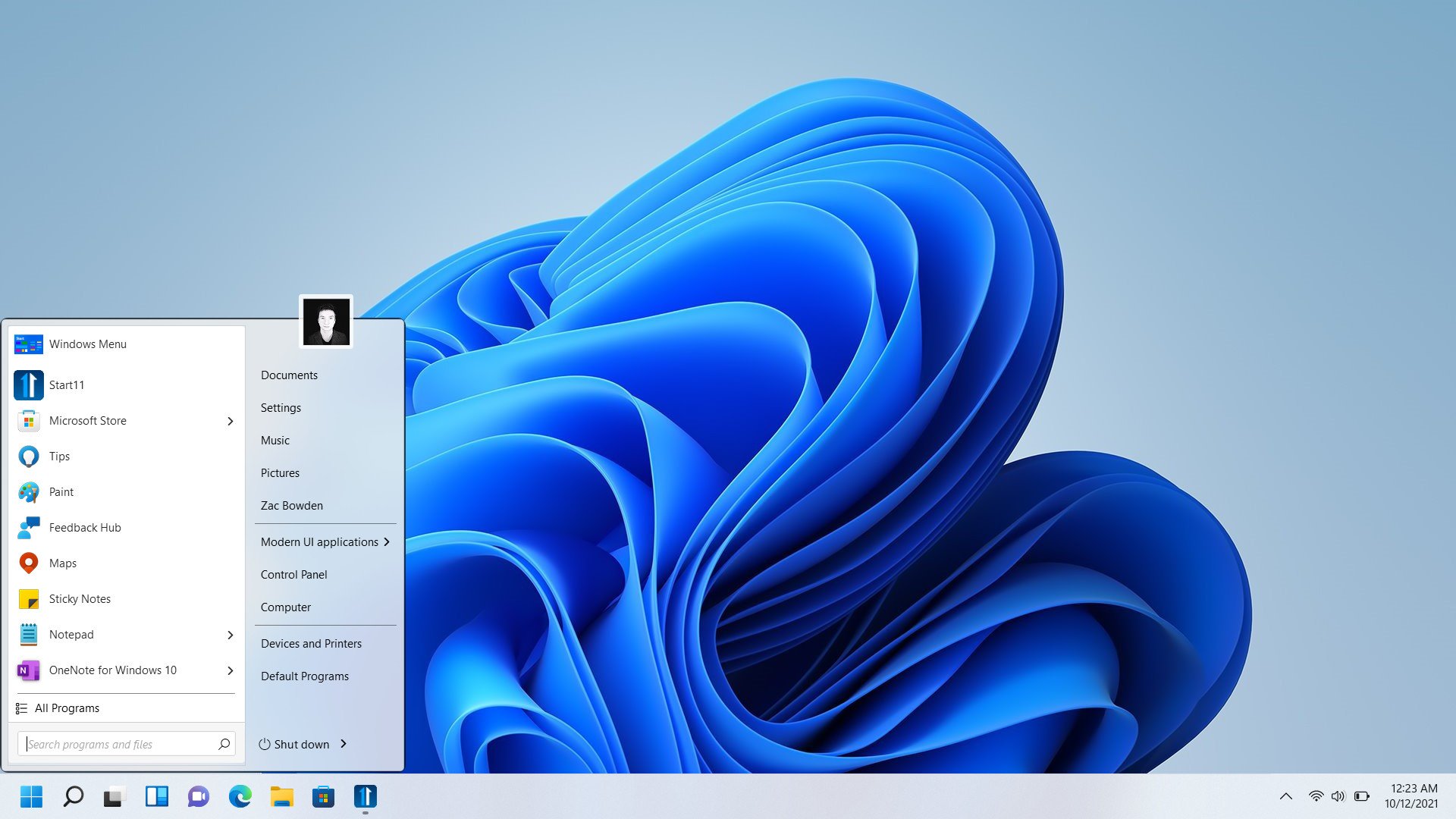
But the great thing about Start11 is the selection of other menus that it also includes. Not only do you get a more customizable version of the Windows 11 Start menu, but you can also switch between custom versions of the Windows 11 Start menu and Windows 7 Start menu. There's also an additional "modern" menu designed by Stardock which takes inspiration from the Windows 7 menu design.
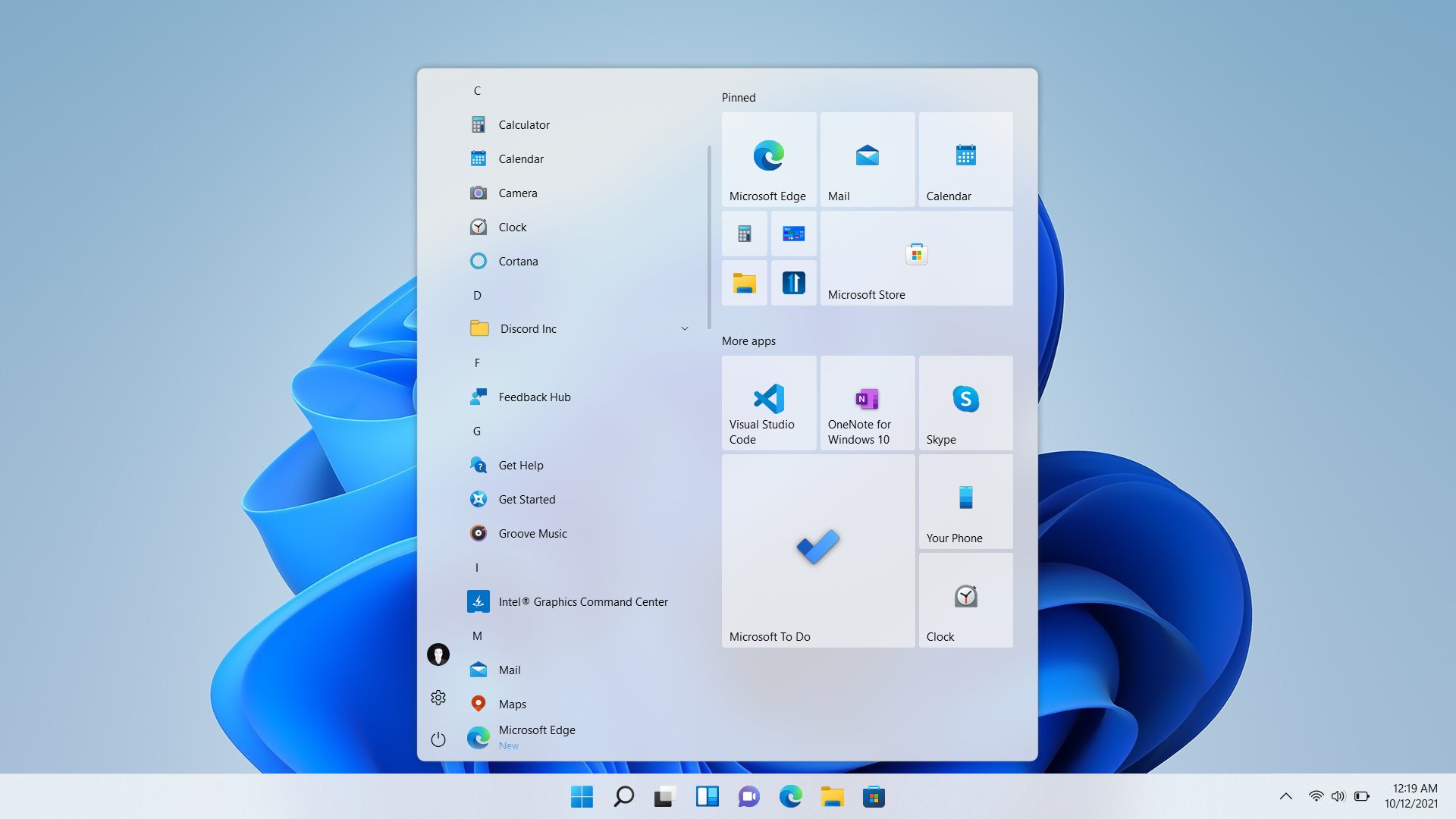
The Windows 10 Start menu brings back the live tile interface that's no longer present on Windows 11. Now unfortunately, the live tiles themselves aren't live, but the grid of resizable tiles does make a return and can be customized just like they could on Windows 10. The only other thing really missing here is the ability to create folders for certain groups of apps. You can even make it full-screen if that's something you miss from Windows 10.
The Windows 7 Start menu does exactly what it says on the tin, bring back the classic Windows 7 style menu with your traditional list of all apps, fly-out menus for the shortcut buttons on the right side, and even your profile picture that fades between icons when you hover over them. It's weird being able to go back to this style of menu on Windows 11, though is surprisingly fits right in.
You can of course customize all kinds of aspects to these menus, including colors, shortcuts, icon sizes, and much more. You can really dial in the kind of menu you want with Start11, which is going to be great for power users who have specific needs from their Start menus.
Improved Taskbar
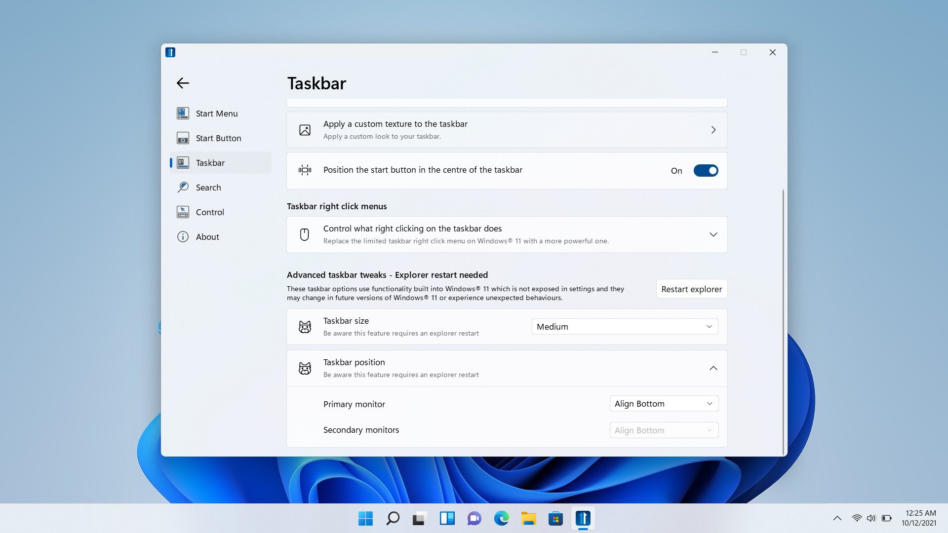
Start11 also taps into the new Windows 11 Taskbar to bring back some Windows 10 functionality, including the ability to move the Taskbar back to the top of the display if that's something you prefer. It also brings back size options, once again allowing you to switch between small, medium, and large Taskbar sizes. I did find that the large taskbar size was a little buggy, though I think that's more on Windows' part than Stardock.
It also brings back the ability to right-click the Taskbar to access the Task Manager and cascading windows options, two power user features that I'm sure many will be happy to hear has returned. Jumping into the customizability aspect, Start11 allows you to customize the Taskbar in new and unique ways too. You can change the Start icon to anything you like, and Stardock has an entire marketplace of icons you can choose from, or you can pick your own.
Then there's granular control over asthetics such as how transparent the Taskbar is, plus the ability to change its color to anything you like. You can even choose between different "textures" for the Taskbar, such as wood or fabric. This isn't much to my taste, but you can choose your own image too if you have something else in mind.
I would like to see Stardock add back the ability to drag files into app icons to paste them into running apps. This is a feature that's missing on Windows 11 that has really hit my workflow, and would make Start11 even more worth it. Unfortunately, Start11 doesn't solve that problem, at least not yet.
A great solution
Overall, I really like what Stardock has done with Start11. This is a company that steps in to do things right when Microsoft seemingly can't. I will say the app can sometimes lack animations and "polish" from a visual perspective, but that's a rare case, and is something that can be fixed in future updates. For the most part, Start11 feels like it's part of Windows, and that's a great thing.
You can grab Start11 from Stardock for $5.99, and there's a free trial if you'd like to test it out first before you commit. Start11 works on both Windows 11 and Windows 10 too, so if you'd like the Windows 11 Start menu on Windows 10, Start11 can bring that experience to you.
Start11
Start11 is here to give you the Windows 11 or 10 of your dreams.

0 Commentaires